What does it take to create an iconic print design? From billboards to film posters, how does a brand create a memorable print campaign? Let’s take a look at some of the most memorable and iconic film posters of all time…
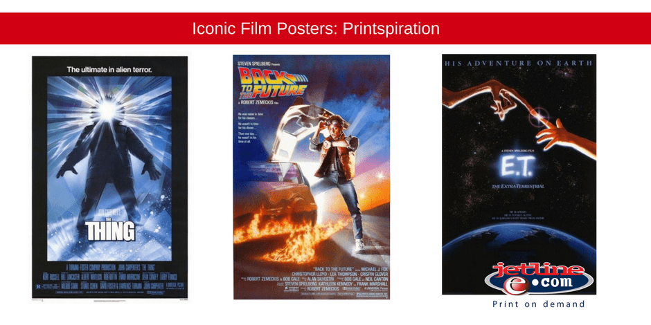
E.T

E.T gifted pop culture with not one, but two iconic images. The image of Elliot riding his bicycle across the silhouette of the moon, and the film’s original poster (as seen above). This visual is reminiscent of Michelangelo’s famed Sistine Chapel fresco, “The Creation of Adam.” With this artwork as reference, the poster is layered in meaning. The twist? The fingers connecting in front of a magnificent galaxy are those of E.T and Elliot – an alien and a child who form a strong bond on Earth.
The artist behind the poster is renowned illustrator John Alvin. He added a personal touch to the image too. The child’s hand on the poster is his daughters!
Jurassic Park

Another iconic film poster, another iconic Spielberg film. When we look at the poster, we immediately know what the movie is about – dinosaurs, simple as that. This may be straight to the point visually, but it serves a greater purpose – and this purpose has a Hollywood agenda.
This is not simply a poster, it is a branding and marketing campaign in its own right. The simple image of the fossilized dinosaur doubles as the ideal franchise logo. This logo is used in the fictional game park that is depicted in the film. It also doubles as the icon plastered across the films merchandise. This simple image transcended fiction, becoming a big part of the pop culture canon.
The Thing
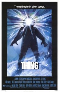
Here is a fun fact: Universal Studios called up famed artist Drew Struzan, and asked if he was interested in creating a poster for the film. The only catch? They needed the design by the next morning! They also couldn’t provide Struzan with any reference images to work from. As a designer, this is a challenge, but Struzan took it in his stride.
So, how did he manage to create one of the most memorable prints of all time with such a tight schedule? By keeping it simple and literal. Apparently some people thrive under pressure…
Back to the Future

This sci-fi film broke genre boundaries because it was not just created for sci-fi fans, but for family viewers. Because of this family dynamic, the poster had to be somewhat relatable. With the lead character played by well-known actor Michael J Fox, the film quickly becomes relatable.
This is another poster created by talented designer, Drew Struzen. It forms the foundation of the trilogy, and the posters that followed. The first poster only features Morty, while Doc is inserted into the second poster, and Clara joins the two in the final poster of the trilogy.
American Beauty

American Beauty took the concept of suburban American life, and the white picket fence ideal – and flipped it on its head! The film revealed a sordid side of suburbia, a tale of lost souls desperately seeking an escape from their world.
The entire film revolves around a fantasy sequence featuring a school girl bathing in a bed of roses. The scene is subtly and gently reflected in the poster design, teasing the viewer about the films content. The typography of the poster is small in comparison to the image itself, drawing the eye closer, revealing the films tag line, “look closer…”
The evocative poster was designed by Pulse Advertising, and has solidified its place in the pop culture canon.
Trainspotting

Designers Robert O’Connor and Mark Blamire, were given images from the Beatles biopic ‘Backbeat,’ to use as a reference point for the poster design. They despised the concept of having a single shot of all the characters huddled together, and just couldn’t get it to work. Taking inspiration from another iconic film poster, Tarantino’s ‘Reservoir Dogs,’ the designers used individual shots of the characters, stressing the individuality and unique voice of each persona.
Blamire goes on to explain the rest of the design, “We introduced the device of a train station departure board and added the caption, ‘the film is expected to arrive 02:96’ to continue the theme of the departure board.”
The Exorcist

The brief for the poster provided by designer Bill Gold, stated unequivocally that no cliched image of a possessed girl be used on the poster, and that there should not be any religious iconography or reference in the design.
The creative team struggled to deliver on his vision, offering a variety of options that were all rejected.
Gold took this into his own hands, and went through stills from the film. The film still that was chosen is the silhouette of the priest arriving at the home of the possessed girl.
Gold is quoted as saying, “When you looked at this still, you knew somehow that whatever is about to happen inside that house, is not going to be good.”
Jetline: Poster Printers South Africa
Are you thinking of making the ultimate poster to promote your business, or event, or film? A daunting task to say the least. Your poster needs to reflect your message, tell a story, and catch the eye of your specific audience. It is important that you work alongside an experienced design and printing company to help you put together a poster that gets your target market talking.