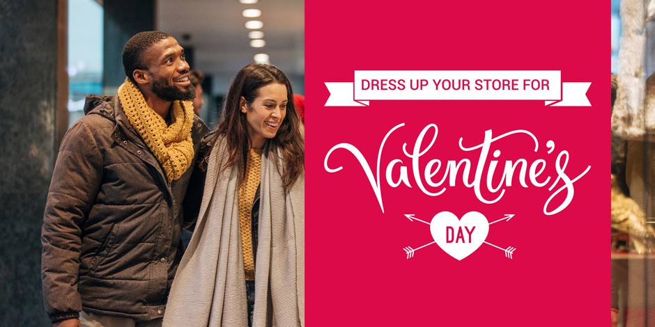
Editorial and magazine design is a very visual medium. Images can vary from publication to publication, some focusing more on photography, while others focus primarily on infographics and illustrations. Great magazines make use of visuals in an attention-grabbing, strategic way. Their images are used to tell a story, grab attention, and create a particular pace within the layout of the print.
As a professional design and printing company, we offer up some tips to help you use images more creatively and effectively in editorial design.
Be more creative with your photography
Most of the time photography is a literal representation of content in an editorial. For example: using a portrait shot for an interviewee. Sometimes being literal is the only choice that designers have.
This kind of literal visual storytelling usually requires a photoshoot, and it offers the perfect opportunity to take creative photographs to suit the layout, tone and style you envision for the editorial.
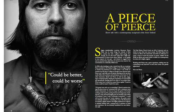
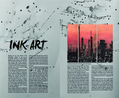
Before organising and attending the shoot, create a rough design layout, and conceptualise where you want the photography to fit. Always consider other page elements, advertisements and typography placements. And then make sure the photographer shoots to fit the space.
However, if budget or time is a problem, you can always take a look at relevant stock images. This is very helpful when it comes to locations, famous people, and news based articles.
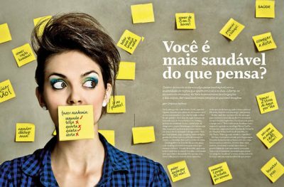
If you are going with stock images, don’t just take one of the first images you see. Dig deeper. Find a photo that speaks to the copy, and tone of your editorial. Look at different angles and filters – and choose the image that best suits your magazine style.
Storytelling through illustration
Illustrations can bring just about any magazine content to life. Infographics, creative icons, and bright stylised illustrations have the power to bring even the dullest business article to life. This creative design adds a lighthearted edge to any copy. Infographics or metaphorical illustrations also have the power to communicate a somewhat complex idea better than copy ever could.
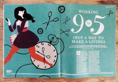

Illustration is also beneficial when an article is exploring a topic that photography would struggle to capture. For example: science-fiction based articles, fictional characters, or out of this world scenarios.
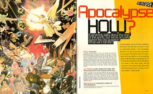
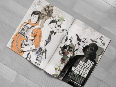
Of course, you will need to commission an illustrator to take on this role, and sourcing the right kind of illustrator is quite a process. If time or budget rules do not allow for a commissioned illustrator, take a look at stock illustrations. This can be useful for icons and copy that require well-known visual cues. Once again, as mentioned previously, take your time when choosing the illustrations for your copy – you don’t want to turn your article into a visual cliché.
Be led by your content
Before you even begin sourcing images for an editorial design, make sure to read the content and understand the tone of the work. By doing so, your creativity will be sparked and you will develop a stronger idea around what kind of imagery to work with. Remember that the style of the copy plays a crucial role in informing the look and feel of the editorial design.
Understanding the copy in its entirety will also help you decide on whether you want to use illustration or photogrpahy, or both.
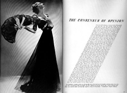
As mentioned above, photography is appropriate for specific subject pieces, be it people or a place. Photography also has the incredible power to impact the mood of a piece.
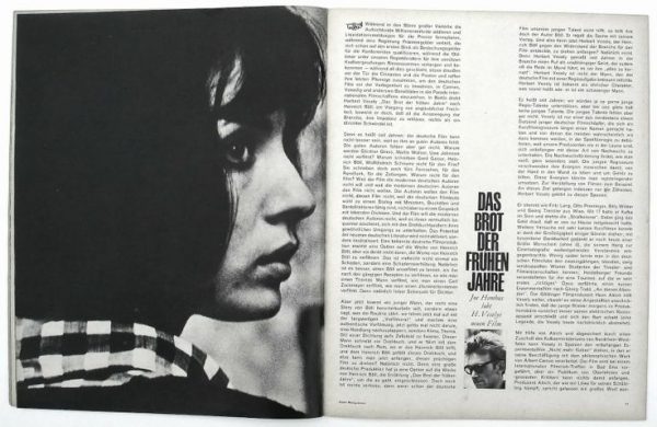
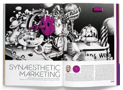
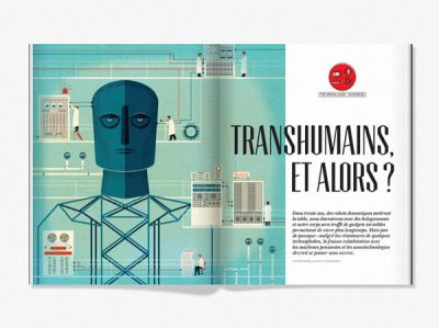
On the other hand, illustration is effective for communicating more abstract concepts and adds a sense of personality, colour, and character to copy.
Whatever design choice you make, make sure it works with the copy.
Hit them with something powerful – and big
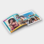
When it comes to print design, remember that a gorgeous full bleed visual creates maximum impact. Fill a full page or make use of a double page spread for an image. If a visual is powerful, give it the space it deserves.
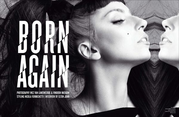
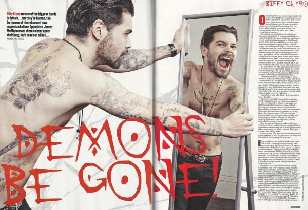
This works well for fashion based articles, landscapes or feature articles. If you have stunning visuals available – take advantage of them.
You don’t want to minimize an eye-catching image by trying to fit it into a text-packed page. Sometimes the visual is the articles best asset and can completely transform the impact of a magazine design.
Be unconventional with cropping
Sometimes, by being unconventional in your design approach is genius. You may be using the same image that hundreds of other magazines have used, but if you change it up, even slightly, you can change the tone of your article and set up a specific mood.
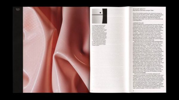
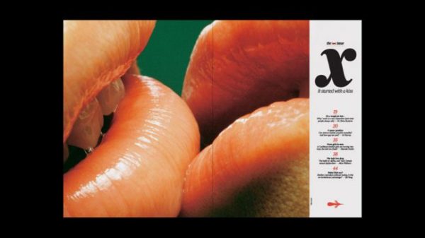
As mentioned previously, full page images offer an edge to any editorial. But close up and unexpected crops can add an eye-catching edge. If the copy and tone of the article suits a cropped image – go for it!
Jetline: Printing Company South Africa
From magazine design and magazine print to billboard design and billboard print, we are the go-to design, print and branding experts.
Contact your closest Jetline today for more information.

